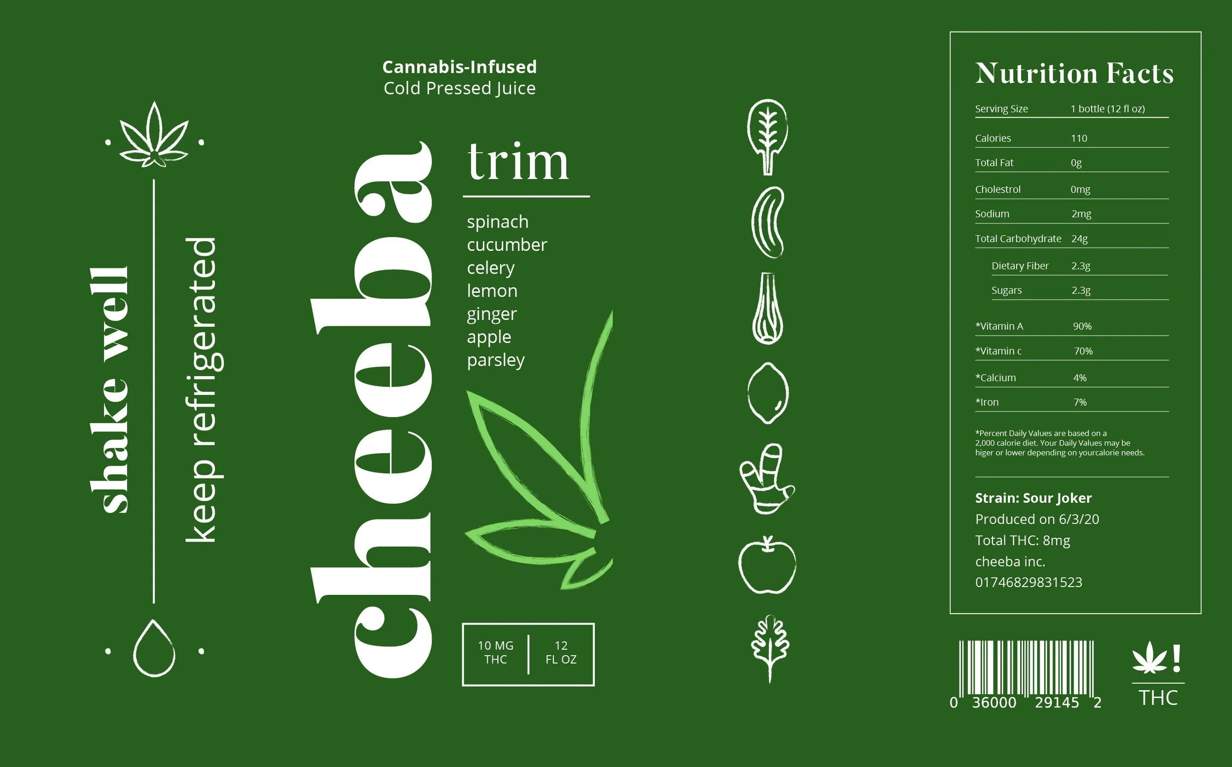
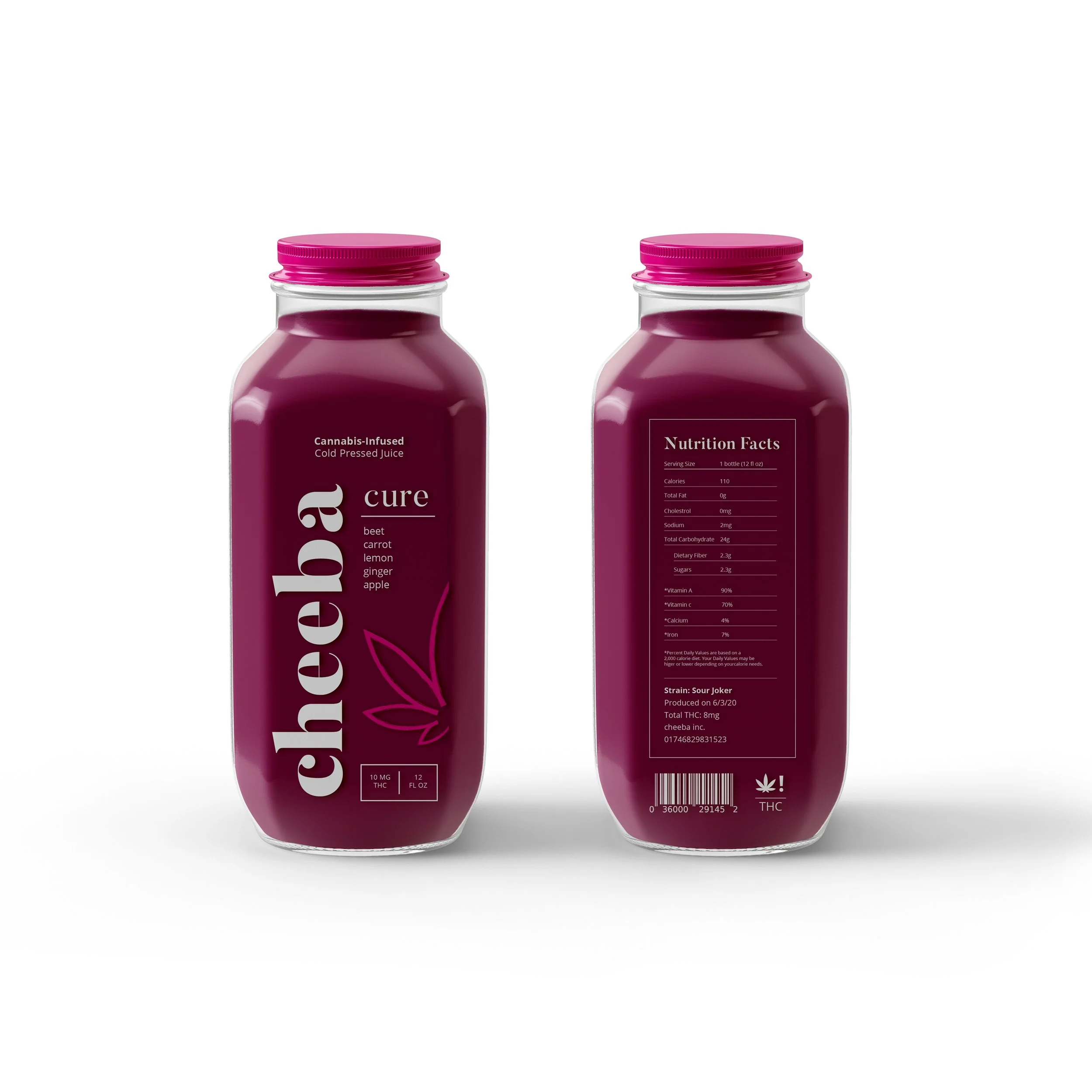
cheeba
cheeba is a brand concept for cannabis infused cold press juices. The packaging was designed to promote a positive and healthy objective around the product. This was accomplished through organic brushes, bright colors, and serif typeface that doesn’t fall short of luxury. The company name cheeba came directly from the slang word meaning marijuana. The four primary colors present as the common colors produced after the fresh fruit is pressed. Whereas the four secondary colors are applied to the branding to add detail and bring awareness to the marijuana content. Icons placed on the sides of the bottles easily show the main ingredients of each flavor. Turning the wordmark (logotype) to the side allows it to stand out while still presenting as legible. Choosing Butler was a no brainers, viewing its classical curves should remind the customer of the flow of smoke. Pairing it with Open Sans’ friendly appearance created a contrast one simply can’t resist.